SafetyBossHub: Streamlining Safety Services for SafetyBoss
Streamlining system communication through a web-app
INTRODUCTION
From define to delivery, a solo service design project to streamline communication between customers and dispatchers for SafetyBoss.
I was the sole Project Lead and Designer, overseeing the completion of both research and design. My role expanded into Service Design where I took a holistic approach, applying ethnography to support my research.
Solo project, supervised by Robert Andruchow.
8 months (Sep '25 – Apr '26).
User Interview, Journey Map, Service Design, Prototyping, User Testing

Customers want to order services in an effective and accurate manner and dispatchers want clear information, centralized tools, and time to manage orders.
The problem SafetyBoss is facing is that customers and dispatchers are unable to effectively communicate due to a differences in field knowledge and ineffective system processes.
SafetyBoss came to me with the idea to essentially create a Skip the Dishes version of ordering services.
Project Goals:
Study how the servicing and dispatching processes work
Understanding the current experiences of customers and staff
Identify design opportunities and possible solutions to streamline the communication between users
How might we streamline the communication between customers and dispatchers?
SafetyBossHub: Streamlining ordering and communication through one system
SafetyBossHub is a web application that allows customers to order services from SafetyBoss in a concise and straightforward manner. Internally, SafetyBossHub streamlines the order processing by collecting complete details at once and automating updates. This system relieves frustrations experienced by customers and dispatchers by centralizing information and reducing the number of communication tools to fulfill an order.
Process
Research & Ideation
Customers experience difficulty interacting with dispatchers who lack field knowledge
A key point of contention between users is that dispatchers are staff who enter the role lacking field knowledge. At the same time, customers are typically company consultants or on-site field workers with many years of experience. This difference in knowledge causes frustration with customers who expect dispatchers to understand specific field contexts.
With this initial information, in the early stage, I set out to understand how the system operates and whether there were any pain points we were not addressing.
Research Methods:
Ethnographic observation at SafetyBoss's headquarters to see the dispatcher's workflow
User interviews with SafetyBoss's CEO, dispatch team, sales team, and long-term customers
Journey map to see the full end-to-end service journey
Co-design with key stakeholders
User Research
Analyzing the full end-to-end service journey from two user perspectives.
The journey map outlines the start to end user journey when a customer places an order at SafetyBoss. Here I specify key information such as the touchpoints, tasks conducted, and emotional state at each stage. At SafetyBoss, I categorized the main stages as Service Needed, Order Request, Confirmation, and Dispatch Job.
From this finding, we found a larger problem that needed to be addressed: Dispatchers lack the tools and resources to service customers effectively.

Defining Persona & Goals
“There are too many forms of communication for example, texts, phone calls, emails, in person conversations...”

26, night-owl, stressed
Their goal is to manage internal processes and reduce the need for back-and-forth with customers.
Project Development
Key Finding: Dispatch faces challenges in managing orders and relaying information.
From my research, I found a larger problem than just customers struggling to place orders: the dispatch team was facing challenges managing multiple communication channels, with a heavy reliance on manual tools such as handwritten notes, back-and-forth messages, and outdated spreadsheets.

I want to have clear visibility of my order and status.

I want to reduce the number of tools I use within the system.

User Testing
Balancing aesthetics with accessibility and function.
Throughout the development phase, I consistently facilitated co-design testing sessions with key stakeholders to ensure accuracy and alignment with goals. I also conducted 6 user tests with the target audience to gather feedback and validate design decisions.
Key Findings:
The messaging center would repeat the existing problems that the service is trying to move away from.
Keep the visuals clear and conventional to account for all digital literacy users.
Intuitive UI and typography enabled users to navigate the interface and complete the assigned tasks.
Based on this feedback, I proposed replacing the messaging feature with a system-wide activity log, refining the design system, and adding supporting text and icons where necessary.

1. Revisiting the pain points
Initially, I agreed to create a messaging feature within the app to consolidate communication into a single format.
However, after I completed the initial wireframe, I realized it might not be addressing the real issue and was actually negating the system's purpose of minimizing unstructured conversations and sifting through endless dialogue.
From this, I proposed a new approach: a system-based activity log that tracks activity within each order, the user who created the change, and links it to the system to push updates to the customer to signal progress.
2. Simple, conventional, & straightforward
The project had no prior inspiration besides the functional aspects of Skip The Dishes. Because of this, I struggled to envision a consistent style to use across the screens, leading to multiple iterations and changes throughout the process.
Through testing at each stage, I recognized the importance of applying fundamental design principles. From presenting my first version with limited structure to a complete design system with consistency and pattern recognition, I validated my design with users, making it easy to understand and consistently applied throughout the system.

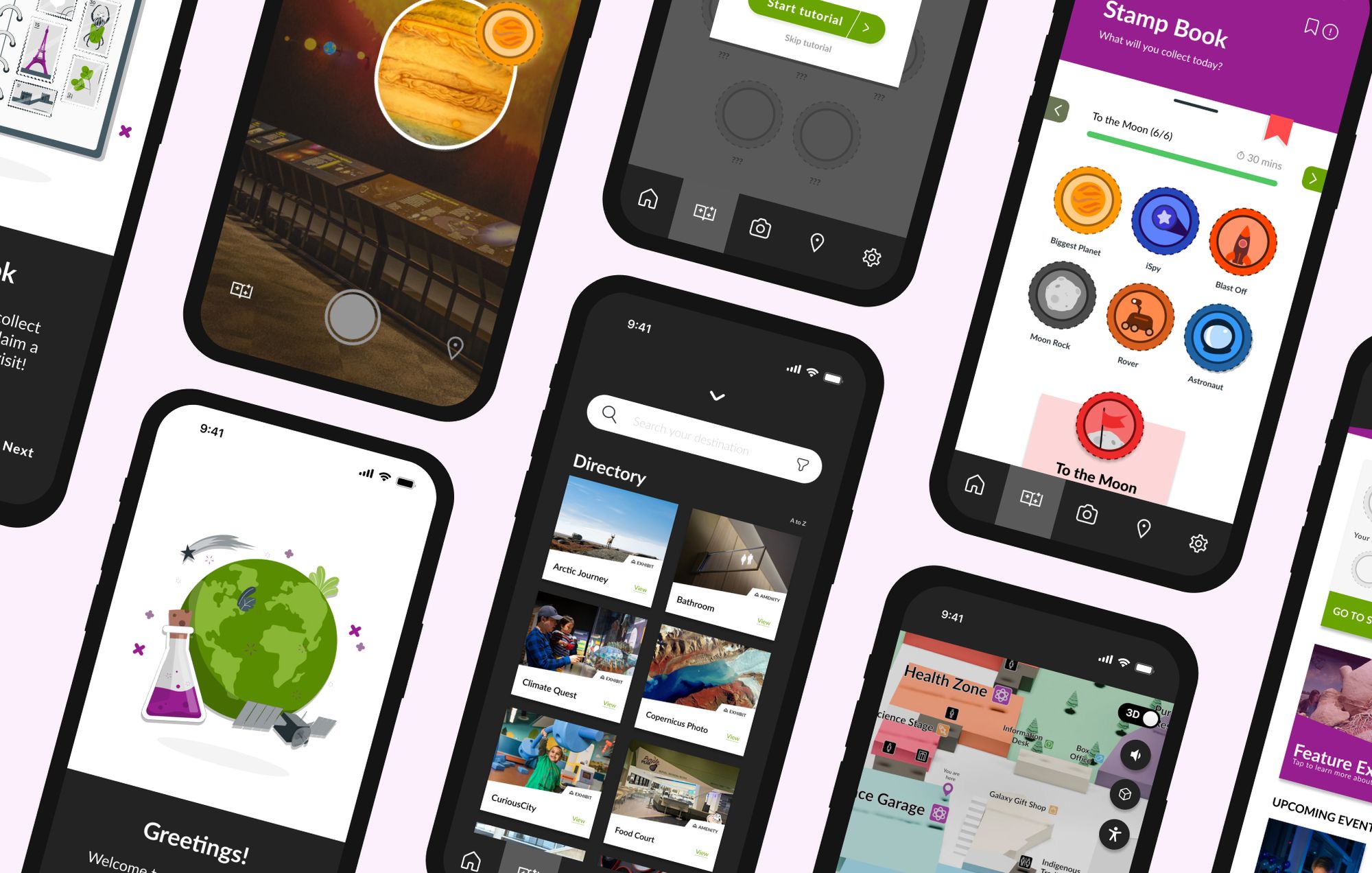
Final Wireframes
Customer-Facing Screens

Dispatcher Tools

Linking the Users

Project Takeaways
The holistic perspective of service design
My biggest lesson was learning how to advocate for a solution beyond the original scope. Taking user insights to address the true pain points and presenting that to key stakeholders was a foreign concept. However, because of it, I created an even more meaningful solution. What could have ended as a surface level product turned into a redesign of the service itself, relieving pain points across multiple points of the service journey.
Some key takeaways from this project are:
Prioritize key functionalities over appealing nice-to-have features
Importance of questioning and revalidating my design choices against research findings
Working within an existing system and client budget requires thinking ahead and the ability to adapt to constraints