.png)
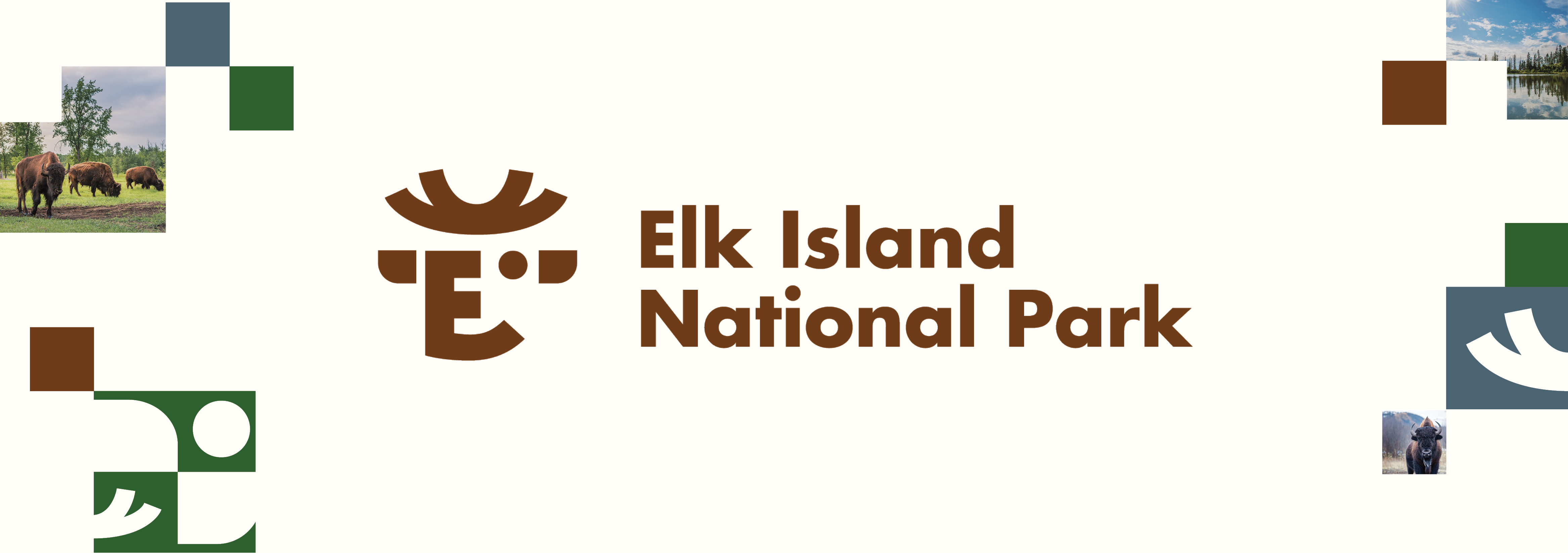
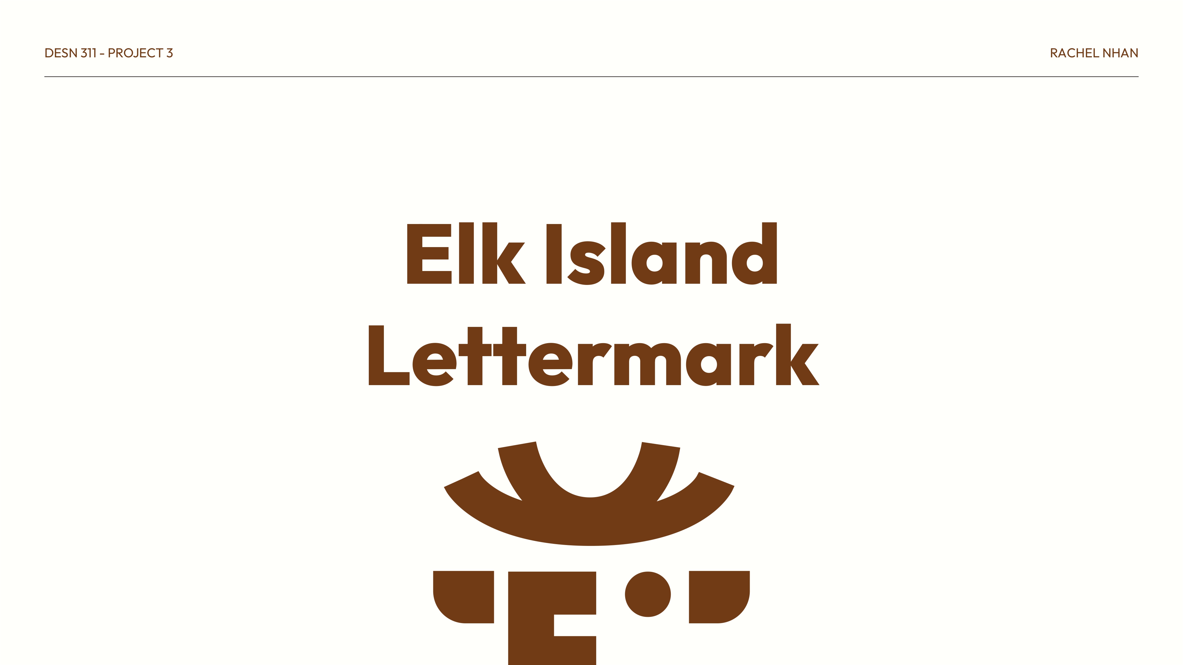
Developing a Lettermark for Elk Island National Park
Elk Island National Park is a letter-mark creation project to reimagine the existing brand into a letter-focused design.
project scope
This work was a brand identity and lettermark design project for Elk Island National Park. The goal of this project was to create a cohesive brand identity that gave off a structured and creative tone to the beloved park.
DESIGN TOOLS
Illustrator, Photoshop, InDesign, Procreate
.jpg)
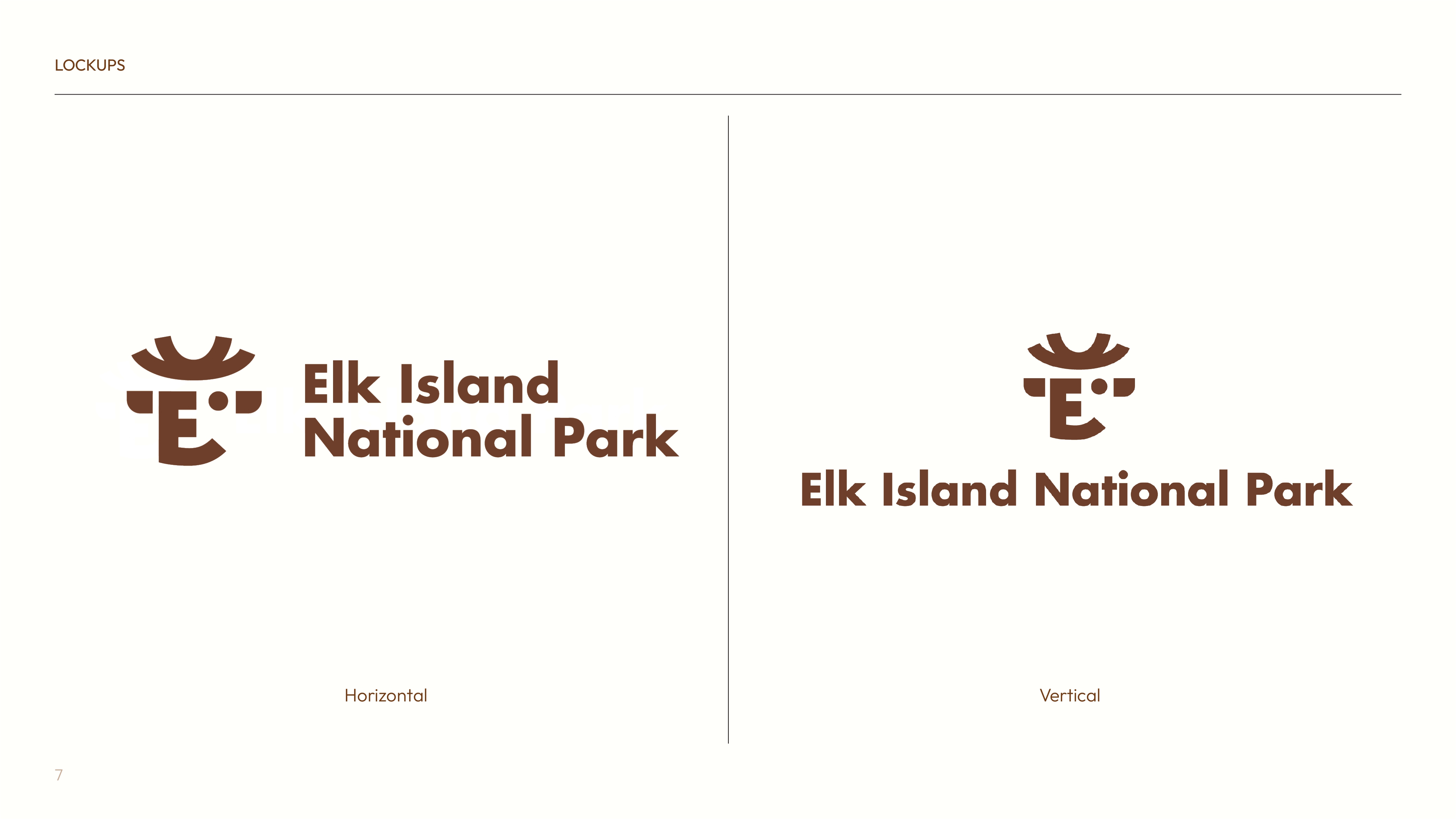
Before & After Comparison
Brand Makeover Reveal
.png)
Old Logo
.png)
New Logo
The Process
Setting the Mood & Tone
Ideating and visualizing the tone for a national park.
This project really challenged me to explore different logo styles and play with white space to create a visually engaging logomark. Some of the ideas that I wanted to incorporate into this project are as follows:
- Antlers!
- Using 'E' and 'I' to create a shape (this idea was eventually revised)
- Adding a natural element even if it isn't antlers..!
.png)
Quickly briefing
the plan...
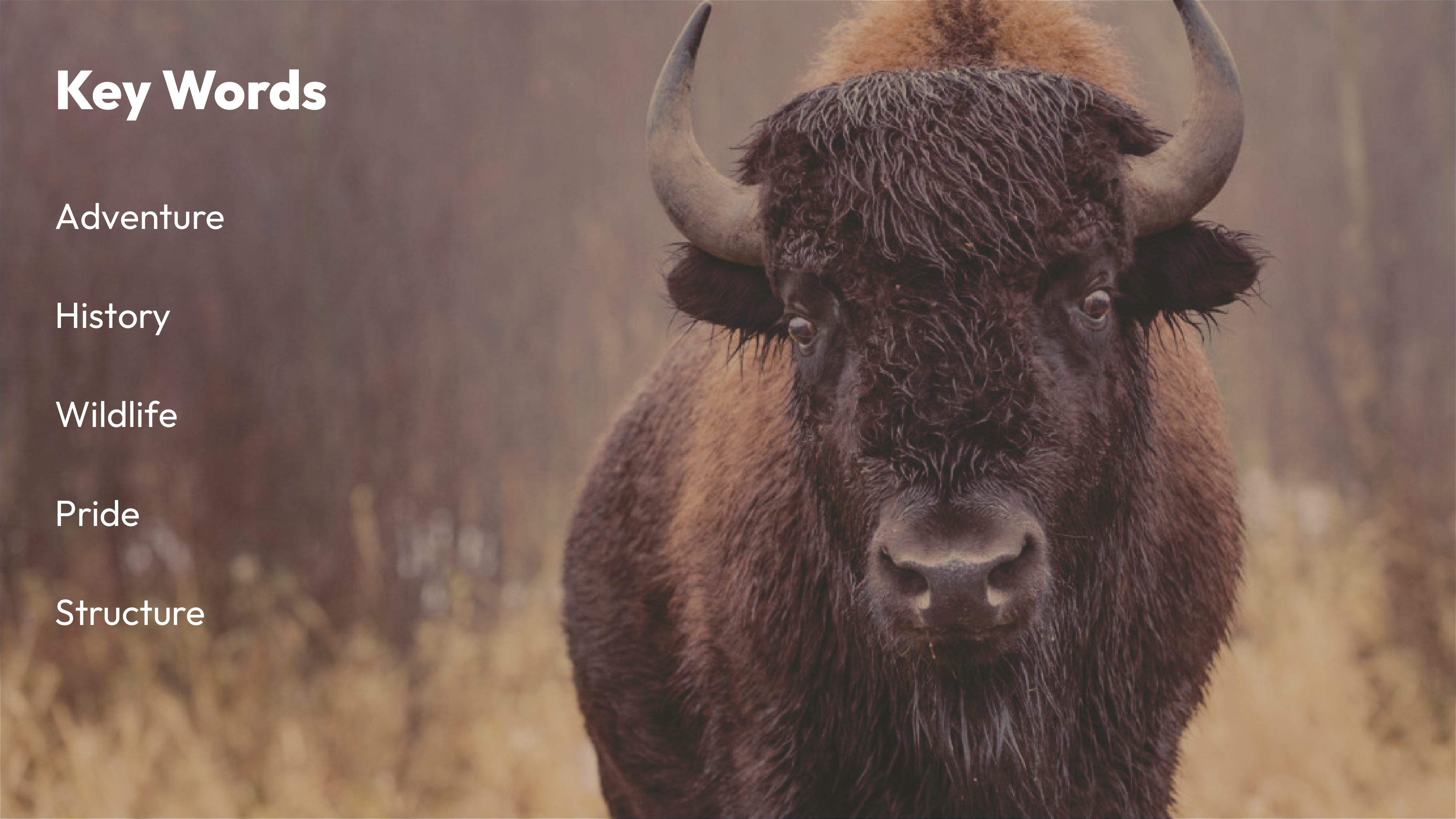
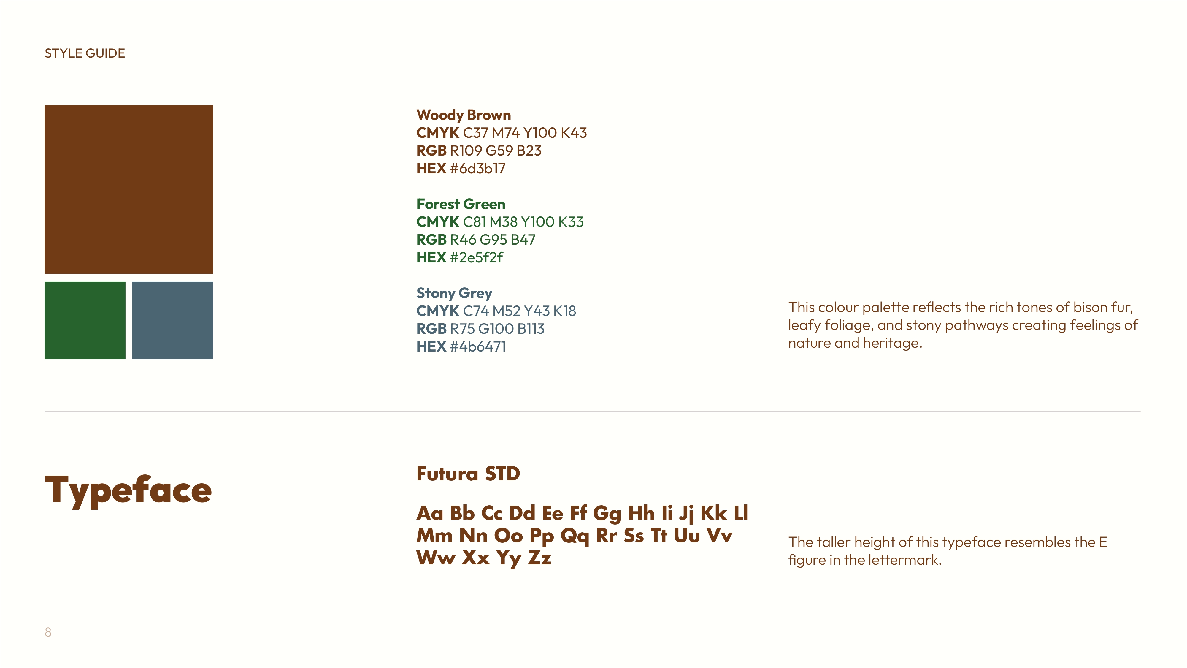
Nature Colour Scheme 🌱
Without straying too far away, we're going to keep the colour palette warm, nurturing, and natural.
Elk Imagery 🦌
To truly speak to its name, it'd be ideal to have an Elk element in the logo in some shape or form.
Clever & Curious 💡
Absolutely love logos with a double illusion effect!
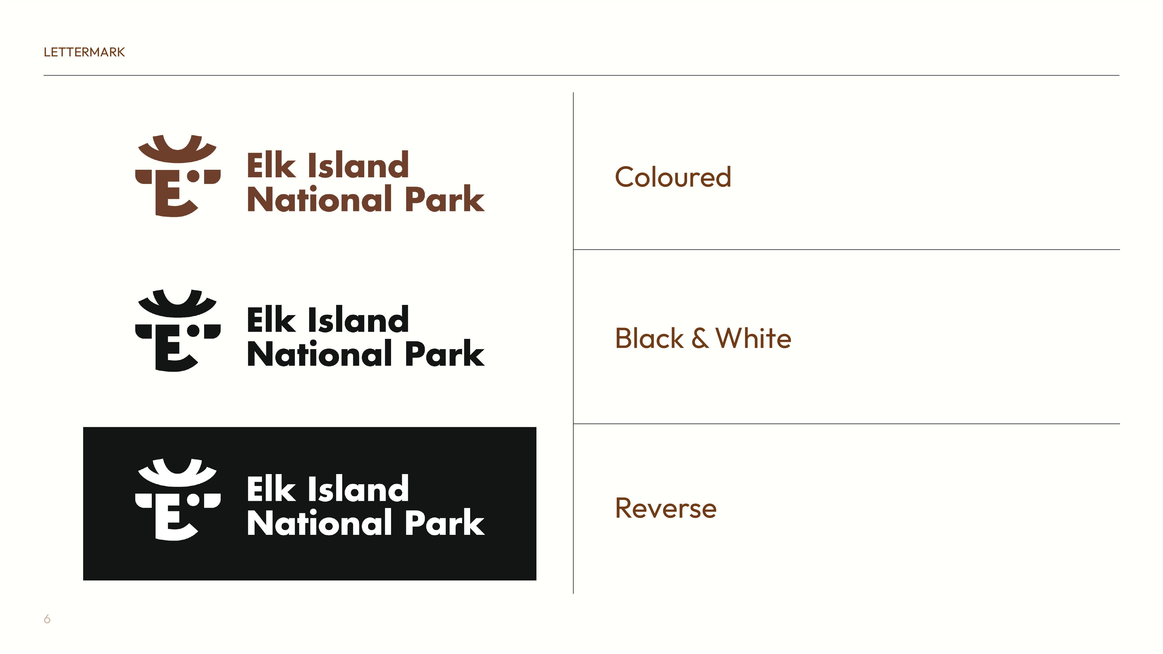
Logo Development
Trying out different styles, drawing from inspiration, and experimenting!
Initially, I had generated some ideas for the logo. Some things that challenged me about this project were:
- Debated between using solely the 'E' or both 'EI' in the letter-mark.
- Oversimplifying the logo in order to retain legibility.
- Creating a letter-mark for 'E' that doesn't already exist.
Sketching initial ideas
.png)
Refining the sketches
.png)
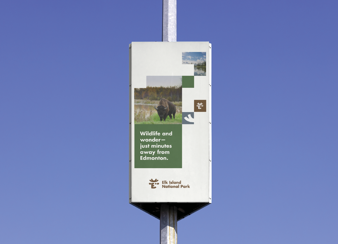
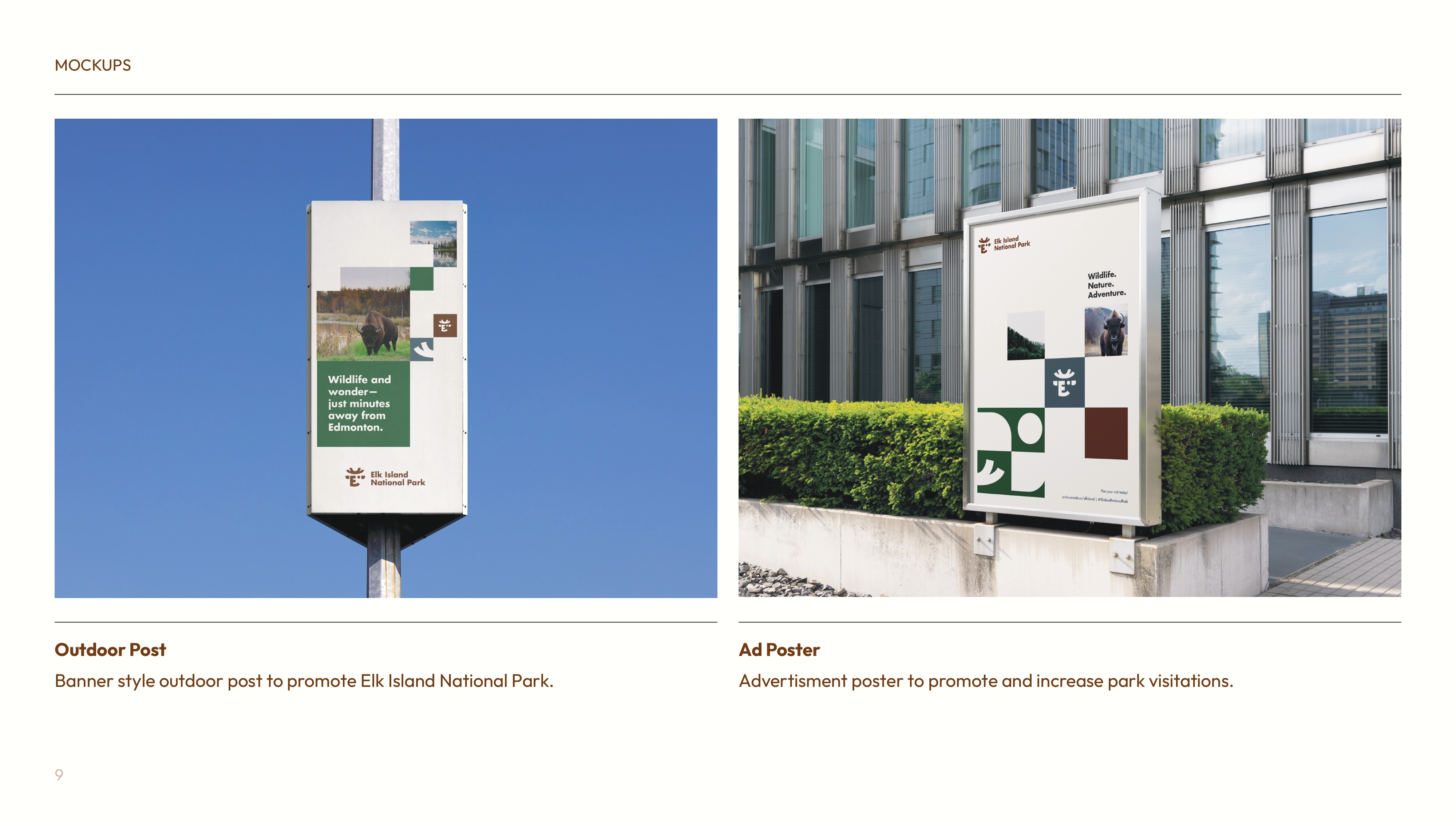
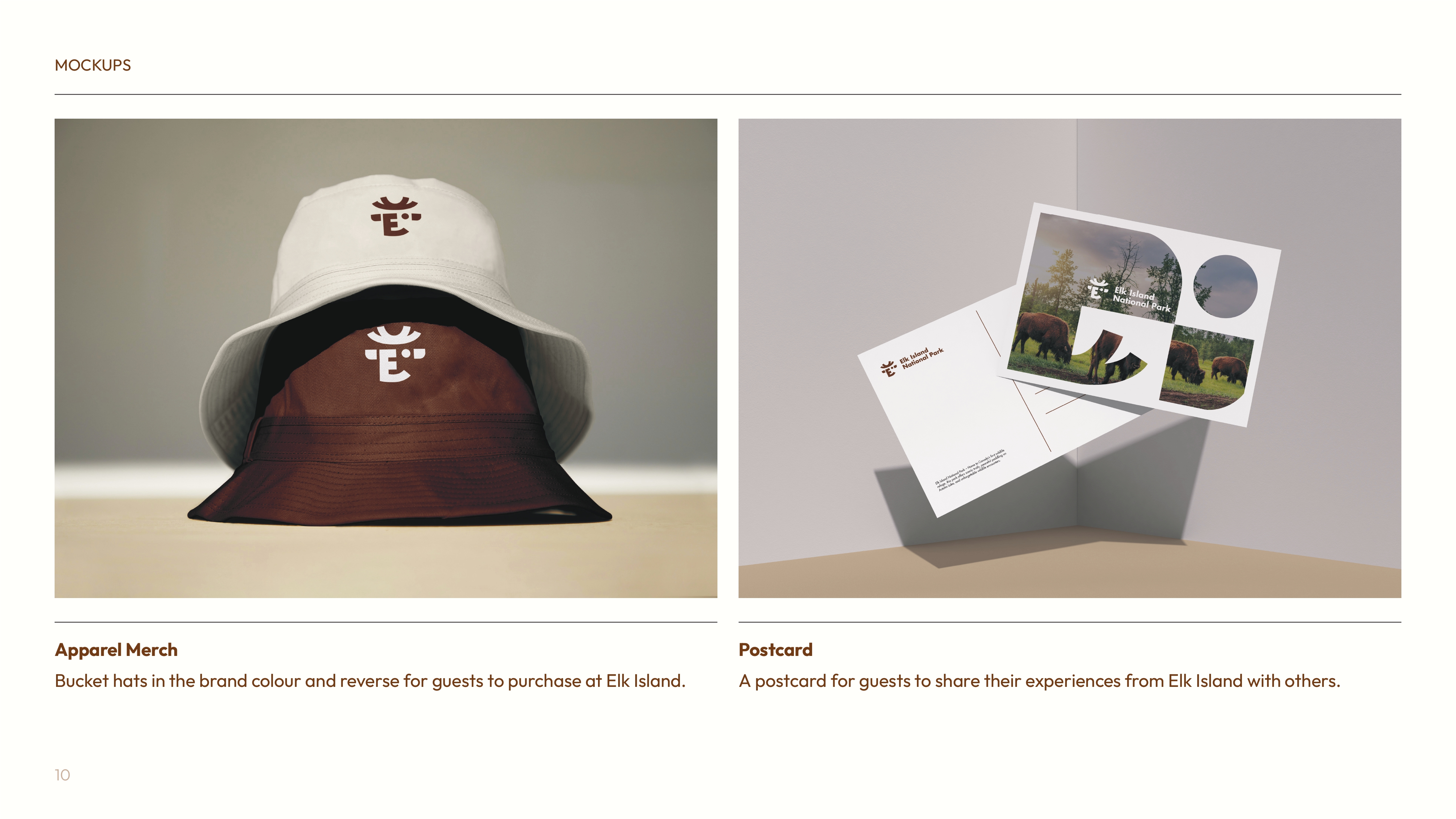
The Redesign - Collateral Gallery
A crisp blend between organic and structure.
.png)
.png)


The Final Branding
Brand Guidelines Slidedeck
See my other branding projects