.png)
Reimagining Taste of Edmonton's Brand Identity
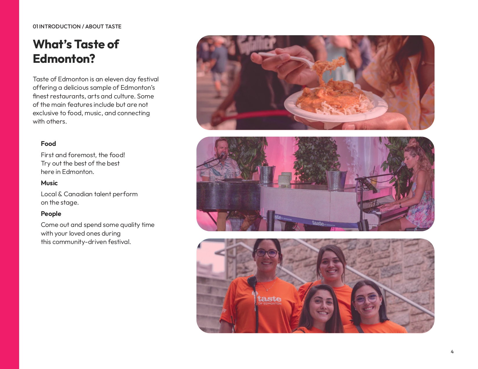
Taste of Edmonton is a brand identity rework project that tackles redesigning the locally-loved festival from the ground up.
project scope
Taste of Edmonton's branding is due for an update and this is my own take on a direction for a potential rebrand. This project consisted of user research, logo iteration, and brand identity development. 3 months (Feb. '25 - Apr. '25).
DESIGN TOOLS
Illustrator, Photoshop, InDesign, Figma
.jpg)
Before & After Comparison
Brand Makeover Reveal
.png)
Old Logo
.png)
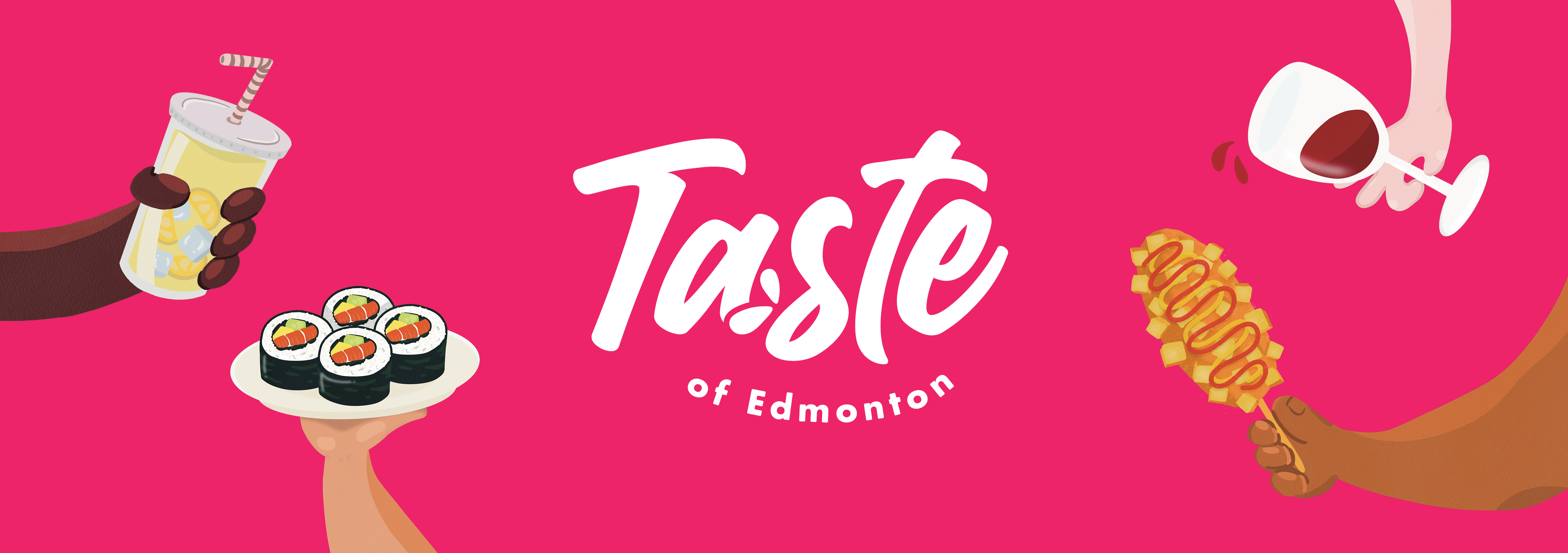
New Logo
The Process
Setting the Mood & Tone
Jumping into the project with a dream and an illustration pen.
My take in this project was to generate a true sense of summer excitement! The inspiration for this project comprised of the following elements and ideas:
- Mixed media (illustration + photography)
- Large wacky illustrations
- Emphasis on showing up and living in the moment!
.png)
Quickly briefing
the plan...
Bye Corporate Blue 🥶
Colour plays a major role in grabbing attention. The current blue is far from a free-spirited summer festival - “It's giving corporate.”
Design Consistency ✅
The scope of this project consists of redesigning EVERYTHING. So, of course, we will need to make a brand identity that spreads amongst all collateral.
Rebuild the Excitement ⚡
The main objective here is to design with the right tone in mind: Summer, heat, and fun!
Logo Development
Iteration after iteration to come up with the best logo!
Initially, I had generated some ideas for the logo. Some ideas that stood out were:
- Food integrated in some capacity (utensils, food crumbs, mouth, tongue, etc.)
- Text-focused to retain the integrity of the event title.
- 'Taste' at the forefront.
Sketching initial ideas
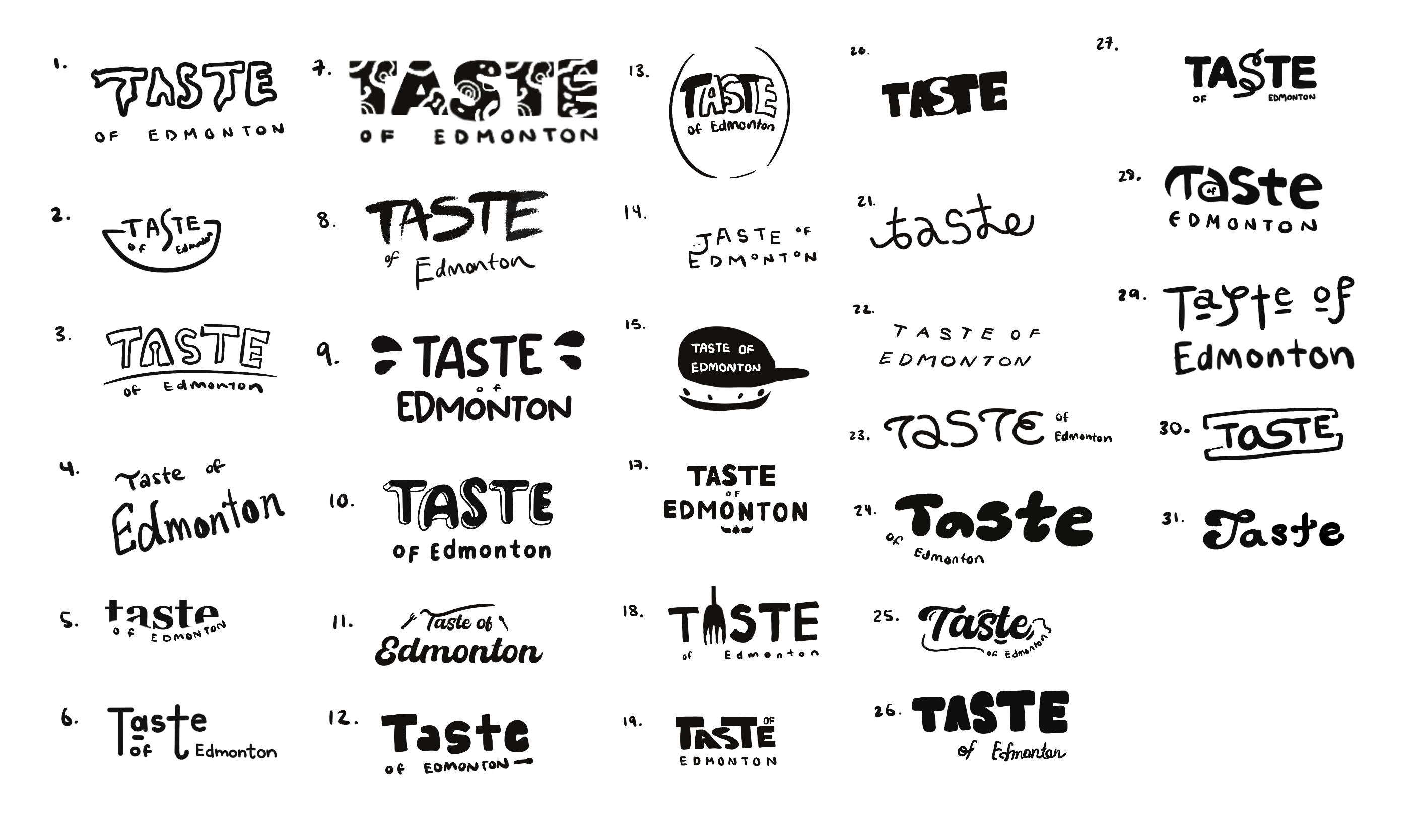
Refining the sketches
.png)
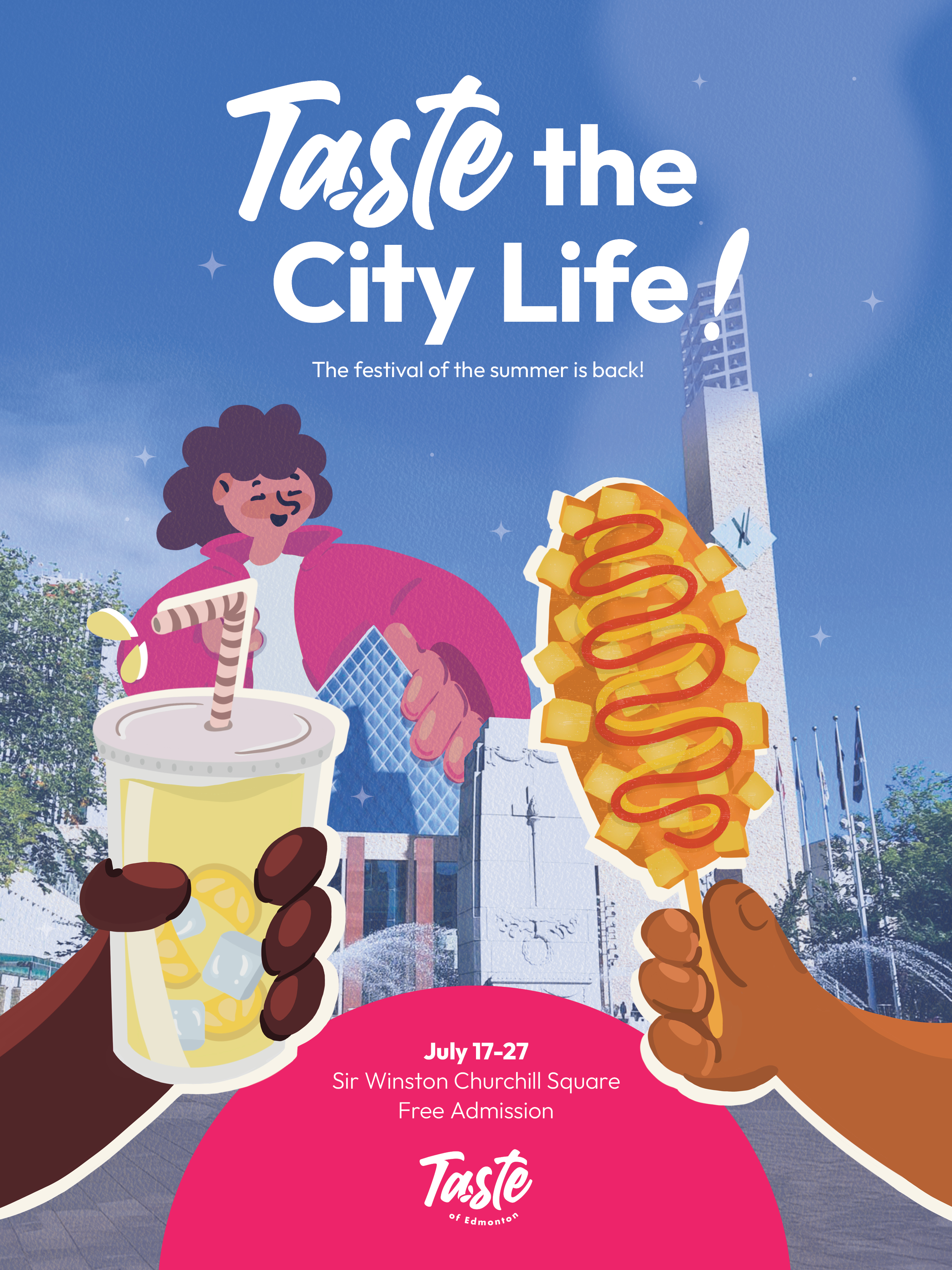
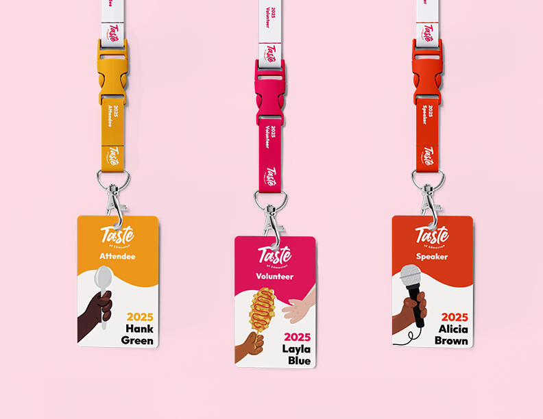
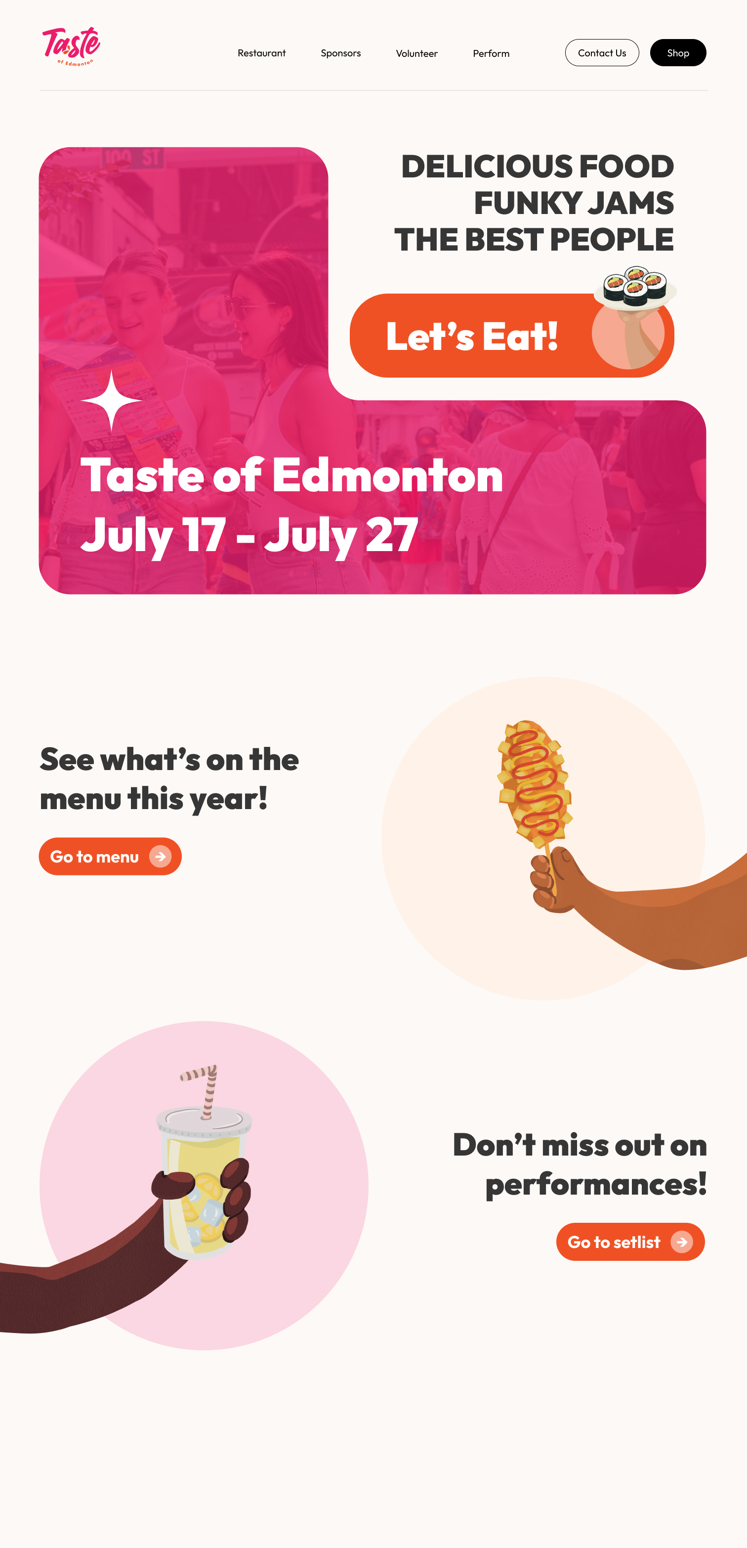
The Redesign - Collateral Gallery
A new, spunky, and exciting take on Taste of Edmonton's branding.
.png)
.png)
%20(1).png)
The Final Branding
Brand Guidelines Slidedeck
See my other branding projects